Some quant work on global cyclicality and equities (Wonkish)
I use three indicators in my work and analysis on the blog to describe the global business cycle; a weighted average of growth in global industrial production and trade, compiled by CPB, the global composite PMI, and a diffusion index of OECD’s leading indicators. Strictly speaking, the CPB data in this context are a coincident indicator, while the PMI and OECD LEIs are short-leading indicators. What’s the difference? At the moment the CPB data, updated through February, provide a guide of what happened at the start of 2024 and perhaps an early read on the Q1 GDP numbers, which have just started to trickle out. By contrast, the PMI and OECD LEIs are supposed to offer an early indication of what will happen in Q2. The distinctive lines between these definitions are fuzzy, so I tend to see these three as separate gauges of where global economic activity—with a weight towards developed markets—is right now.
But how do these indicators relate to the equity market? Let’s try to find out.
The steps
Draw a sample of equities from Eurostoxx 50, USD total return, in year-over-year terms.
Use a correlation-filter to link these equities to the CPB data, the global composite PMI, and OECD LEIs.
Rank the equities according to their correlation with the global macro data. Three periods were used for robustness. Full period, pre-Covid, and post-Covid. The correlation analysis was conduced with each of the three cyclical indicators and with an aggregate normalised cyclical indicator of all three, again for robustness.
Extract the individual names with the highest correlation to the global business cycle, using a correlation threshold of >0.6. This was also done with the inverse sign, extracting single-equity returns with the lowest correlation to the global data, using a correlation threshold of <0.25.
Create a “cyclical equity indicator” with a weighted average of the year-over-year returns of the most cyclical equities, weighted by the magnitude of their correlation to the macro indicators. The same was done done for equities with low cyclicality, creating a “non-cyclical equity indicator”.
Chart this equity indicator with the cyclical macro data.
Analysis/Further work: Create signal analysis for entry/exit points in cyclical trades, turning points in the global cycle, and extremes in the relative return of cyclical vs non-cyclical equities.
The results
The initial steps above yielded the following list of cyclical and non-cyclical equities extracted based on the rules identified above. In general, there are stocks which were borderline for inclusion in the cyclical index rather than the non-cyclical index, reflecting the fact that annual changes in the total return of equities tend to be closely correlated to global business cycle indicators in the first place. Equities are even included in macroeconomic leading indicators in some cases, which creates the risk of double-counting in this type of analysis.
| Cyclical equities | Non-cyclical equities |
|---|---|
| ABB | Iberdrola |
| Allianz | Munich Re-insurance |
| Banco Santander | National Grid |
| BNP Paribas | Nestle |
| BASF | Novartis |
| Compagnie Financiere Richemont | Reckitt Benckiser Group |
| HSBC | Roche |
| ING | |
| LVMH | |
| Mercedes Benz Group AG | |
| Siemens |
The charts below plot the weighted year-over-year total return of the cyclical equities—weighted by the strength of the correlation to global macro data—alongside each of the macro indicators listed above, and then finally against an equally weighted Z-score of the CPB data, the OECD LEI diffusion index and the global composite PMI. Not surprisingly, there is a strong correlation between the most cyclical equities and the macro data in this sample.


These data suggest that the upturn in global economic activity broadened at the start of 2024, mainly via the jump in the OECD LEI diffusion index, and momentum appears to be sustained going into the second quarter. Granted, the trailing return of cyclical equities has softened a touch in the past six-to-nine, but at +20% through April, it remains solid overall.
Extracting a market-based indicator of global cyclical activity is, from the point of view of investors and traders, putting the horse before the cart. After all, shouldn’t we be primarily interested in where markets might go next as a function of the cyclical macro data, or some other indicator for markets derived from the underlying economic data? Perhaps, but trying to pin down the strength and state of global cyclical activity can, in and of itself, be a useful exercise too. This is especially the case from the point of view of identifying turning points in cyclical activity, which could then be used to identify turning points in markets too. From that perspective, the analysis and data presented above offers several avenues for further work. Below I present a few of them.
Picking bottoms and tops in the global cycle
The most obvious next step is to focus on the non-cyclical equities identified via the filter analysis above. This yields the following interesting picture, which plots the global business cycle index against the relative return of non-cyclical equities.

This picture confirms the non-cyclical properties of the single name stocks identified above as the constituents of Eurostoxx 50 with the lowest sensitivity to global macro data. This in itself is a useful piece of information. Many, if not all, broadly diversified equity portfolios will tend to have a high beta to the global business cycle simply because that is a fundamental characteristic of equities more broadly. From this perspective, the picture and list above offers one avenue for investors to construct a factor which, at least in theory, should offer some diversification via relative outperformance during business cycle slowdowns. The big question is what the cost of devoting a share of your portfolio to these non-cyclical equities is over the entirety of a cycle. This is to say, does any downside protection offset the underperformance when things are going well?
More generally, the chart above also suggests that it is possible to exploit the combination of the counter-cyclical nature of these equity returns and the mean-reverting nature of the cycle. The chart below offers one simple way to do this, by pushing forward the relative return of non-cyclical equities by 18 months. Before accusing me of numerology, it is important to be explicit about the assumptions underlying this chart. I start with assumption that both series are stationary, which is to say that the global business cycle and the relative annual return of global cyclical equities are mean-reverting. I then assume that the amplitude of the global cycle and the relative return of non-cyclical equities is roughly 18 months. The result is that local peaks and troughs in the relative return of non-cyclical equities should lead peaks and troughs in global cyclical activity. Do they? Not consistently, but the picture isn’t too bad after the GFC.

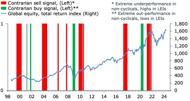
The final piece of the puzzle is an attempt to derive binary buy and sell signals for global equities using extreme highs and lows in the cyclical and non-cyclical indicators above, as well as turning points in the cyclical indicators more broadly. The most obvious place to start is to go back to the chart, which shows the inverse correlation with the cyclical macro index and the relative return of non-cyclical equities. One pair of signals that follows from this is to identify combinations of peaks in global activity and troughs in relative returns of non-cyclical equities to form a contrarian sell signal, and vice versa for a buy signal.
This exercise shows, not surprisingly, that it is difficult to pick tops in equities using binary signals identified from secondary data. Granted, the sell signal went off ahead of the major sell-offs during the Dot-Com bust and on the eve of the Financial Crisis. But the chart below also shows that throwing the toys out of the pram at the first sign of a red bar isn’t always an optimal strategy, due in part to the inevitable false positives but also because the signal tends to go off early. As with all such signals, playing around with the thresholds might improve the precision, but we cannot escape the iron-clad trade-off. We can increase the in-sample precision by firming the thresholds, but the cost is a smaller sample size, which will tend to invalidate the out-of-sample reliability of the signal. As for the buy signal, I was surprised to see that my analysis only produced three since 1998, of which two seems to have worked.
My final, and more fruitful, approach with these data is to go back to chart with the cyclical equity returns and global macro data and attempt to extract a cyclical buy and cyclical sell signal. The idea here is to exploit the idea that you want to buy, and sell, equities when the cycle is turning, and not when it has turned. To create an indicator that capture this rule, the buy signal will identify periods where both the leading macro index and trailing returns are below zero, but turning up. The sell signal, by contrast, will attempt to capture periods where trailing cyclical equity returns are at an extreme, but turning down, with global macro indicators also turning down. The chart below shows that this seems to generate more precise sell signals. The chart also looks decent for buy signals, suggesting that periods where trailing cyclical equity returns and leading indicators are turning up from low points are good times to add equity exposure, at least a rough rule of thumb.

So, what’s the conclusion? Not all equities are made alike and trying to extract the most cyclical and non-cyclical parts of an index can be a good way to get a better handle of where the global business cycle is, from a market perspective, as well as identifying a factor for adding counter-cyclical exposure to your portfolio. Signal analysis is difficult, and must be used with care for investing and trading decisions. The most robust result in my mind is that during times where global leading indicators are depressed and cyclical equities have performed poorly for a long time, turning points can be powerful catalysts for periods of excess returns in cyclical assets.