The burn from the churn
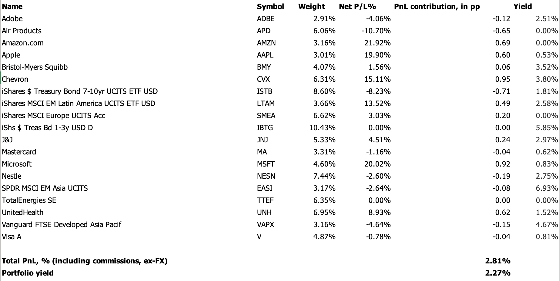
It’s been a while since I discussed markets on Alpha Sources, so I’d thought I resume my coverage by introducing something new; a portfolio tracker. I used to run a page on this site with an occasionally updated PnL table of some of my investments. It was drawn from a home cooked PnL sheet using the API from one of the more famous professional market platforms. I have since lost (regular) access to that service, so it died on the vine, and I have, quite frankly, been too lazy to spin it back up using Google finance or some other open-source resource. But I have recently signed up to Investing.com’s premium service, which, among other things, has a nice portfolio app. It has spurred me on to rebuild a simple PnL model, which I will use in the future, on occasion, to discuss some of my investments, markets more generally and the wider economy. The portfolio I want do highlight today, which I hold in tax free savings account—as opposed to a riskier portfolio in my SIPP pension savings account—looks as follow.
The philosophy behind the allocation across single equities is best captured by my 2020 research piece on portfolio allocation, in which I argue three points. First, in a world where the 60/40 portfolio is offering above par returns through exposure to low, and falling, bond yields and a narrow leadership in equities by the ubiquitous growth and technology factory, investors should focus on how to protect themselves during the inevitable, and often violent, periods of volatility bursts. Second, and counterintuitively, this suggests that investors should allocate a share of their portfolio to the so-called value factor—energy, financials, commodities, defensives etc—because this factor will outperform during periods of volatility. Third, and adding everything neatly together, I showed that this characteristic was well captured by the minimum variance portfolio. The MinVar portfolio, as it says on the tin, is the portfolio that minimises volatility across a combination of assets. I showed estimations to suggest that a minimum variance portfolio of US bonds, growth stocks, value stocks and gold, significantly and consistently outperformed the MSCI World during periods of large drawdowns. I argued that this portfolio feature was worth paying up for, to me at least, in the form of underperformance on the upside.
A lot has happened since 2020, chiefly of which that bonds are no longer in a bull market. In the framework just described, this implies that investors are now perhaps better protected by the bond-leg in a traditionally diversified market portfolio—i.e. one optimising the equity tranche between the allocation of growth and value stocks—indicating that serially underperforming value stocks can be ditched altogether. I am not sure. Bonds have been stung by rising inflation, and if that is now a more persistent feature of the macro-landscape it suggests that investors should continue to lean on value stocks, which tend to do well in periods of high inflation.
The allocation across single equities you see above is found by looking for the minimum variance portfolio among the world’s largest stocks—the biggest components in the main global equity, growth, and value ETFs—using annual total return series. I do think it is important to be open about the sample that you’re drawing your investments from in these instances. Pick a different universe, you’ll get significantly different results. I have experimented with optimising over ten-year and five-year horizons, but the results don’t seem to change that much. Remember here one of the key assumptions from the textbooks on the main workhorse models in modern portfolio theory. The weights in the minimum variance portfolio, which optimises over one variable; variance, ought to be more stable than for the tangent portfolio, which optimises over both return and variance. The best way to explain the practical difference between optimising by minimising variance rather than maximising the Sharpe ratio, the so-called tangent or efficient frontier portfolio, is that the former puts a relatively high weight on negative values in the covariance matrix—i.e. choosing stocks whose returns are inversely correlated—while the latter needs to optimise for both high returns and a relatively low variance.
I optimise conditional on a Sharpe ratio at two or higher—If I didn’t impose this constraint, I’d just end up with everything in value equities—with a maximum weight of 10% in each stock, and with a zero constraint on a few very volatile equities. These three constraints are obviously hugely influential on the result, so again, it is important to be open about them at the outset. I use Excel’s solver to choose the weights in my portfolio, which requires a few relatively simple steps of matrix algebra.
A stock portfolio with the universe and parameters above will tend to be heavily concentrated in U.S. large caps, so I have added a global factor by investing in select non-US equity ETFs, just in the odd chance that US equities more generally would underperform. Recently, that has been a good call. I am currently re-estimating and rebalancing every six months, but I must admit that I am considering moving to annual rebalancing going forward to keep down transaction costs. I have recently rebalanced, and taken the overall share of funds allocated to equities down, slightly. The recent rebalancing has added Visa, Mastercard and Total SA to the portfolio, ditching JP Morgan, Bank of America ConocoPhillips, and Verizon. This leaves the portfolio with a zero allocation to financials, a gap that I am considering closing via an ETF. Normally, the portfolio would not change this much at rebalancing, but the universe of stocks has changed a bit since I started using this method. I have also, within the bond allocation, rebalanced in favour of the front-end, due to the inverted yield curve. Overall the statistical details on the single equity portfolio above, i.e. ex-ETFs, are as follows, using 5y total return series in USD terms, with weekly observations.
Expected annual total return: 17.5%
Standard Deviation: 9.6%
Risk-adjusted return (Sharpe ex-risk free rate): 1.8
Skew: 0.06
Kurtosis: -0.5
the burn from the churn
So far, the portfolio has kept its head decently above water, especially considering dividends. I am a GBP-based investor, so I have suffered from a weaker dollar in the past six months. That’s fine. It means that my purchasing power is now higher if I add positions in US securities with new additional savings in GBP. More generally, the clue to the past year’s performance is in the title. Many of the classic value sectors—in particular energy stocks—roared higher last year, leaving the erstwhile high-flying growth stocks for dead. This year has so far been a mirror image, and unless you managed to allocated aggressively in favour of this shift—and some investors I am sure did—you’ve likely suffered a version of what I suggest in my title. Last year’s winners are this year’s losers and vice versa, leaving performance of the portfolio as a whole decidedly underwhelming. The portfolio has been underperforming the market this year, especially without counting the contribution from the non-US ETFs, but this has to be seen in the context of significant outperformance last year as the main global equity indices were stung by war, energy crises and higher interest rates. Interestingly, or perhaps worryingly, the main equity indices are up handsomely this year, though still down from their highs in 2021, even as neither of these headwinds have gone away. Markets are now sporting a pre-Covid style rally—dominated by a few select technology growth stocks—in a post-Covid macro landscape characterised by significantly higher interest rates and sticky inflation. I am all for techno-optimism on AI, and I respect the wall of worry as much as anyone, but this still looks fishy to me. I am happy to stick with the burn from the churn, for now.